The matplotlib library in Python comes with a number of methods to build highly customizable plots. In this tutorial, we will look at how to rotate axis labels in a matplotlib plot with the help of some examples.
How to rotate axis labels in matplotlib?
- If you’re working with a single plot, you can use the
matplotlib.pyplot.xticks()function to rotate the labels on the x-axis, pass the degree of rotation to therotationparameter. You can similarly rotate y-axis labels usingmatplotlib.pyplot.yticks()function. - If you’re working with subplots, for each subplot, use the subplot axes object’s set_xticklabels() to rotate the labels on the x-axis. Note that you have to pass the labels to use along with the degree of rotation to this function. You can similarly rotate the y-axis labels of a subplot using its axes object’s
set_ytickslabels()function.
Let’s now look at some examples of using the above syntax –
Example 1 – Rotate axis labels for a single plot
Let’s create a scatter plot with some data.
import matplotlib.pyplot as plt

# x values - years
x = [2011, 2012, 2013, 2014, 2015, 2016, 2017, 2018, 2019, 2020]
# y values - 1 USD in INR
y = [46.67, 53.44, 56.57, 62.33, 62.97, 66.46, 67.79, 70.09, 70.39, 76.38]

# plot x and y on scatter plot
plt.scatter(x, y)

# add axes labels
plt.xlabel('Year')
plt.ylabel('1USD in INR')
Output:

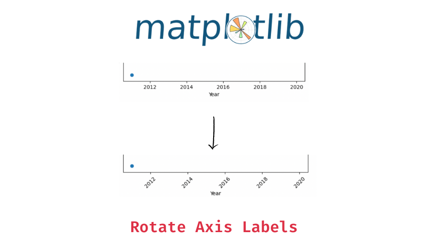
You can see that the labels, by default, are not rotated. We generally rotate labels when they’re too long and overlap each other and thus rotating them helps with the label readability.
Let’s draw the above plot again but this time with the x-axis labels rotated 45 degrees.
# plot x and y on scatter plot
plt.scatter(x, y)

# add axes labels
plt.xlabel('Year')
plt.ylabel('1USD in INR')

# rotate x-axis labels
plt.xticks(rotation=45)

# plot
plt.draw()
Output:

You can see that the axis labels are now rotated by 45 degrees. You can also change the horizontal alignment using the ha parameter. By default, the labels are aligned to the center of the ticks.
Introductory ⭐
- Harvard University Data Science: Learn R Basics for Data Science
- Standford University Data Science: Introduction to Machine Learning
- UC Davis Data Science: Learn SQL Basics for Data Science
- IBM Data Science: Professional Certificate in Data Science
- IBM Data Analysis: Professional Certificate in Data Analytics
- Google Data Analysis: Professional Certificate in Data Analytics
- IBM Data Science: Professional Certificate in Python Data Science
- IBM Data Engineering Fundamentals: Python Basics for Data Science
Intermediate ⭐⭐⭐
- Harvard University Learning Python for Data Science: Introduction to Data Science with Python
- Harvard University Computer Science Courses: Using Python for Research
- IBM Python Data Science: Visualizing Data with Python
- DeepLearning.AI Data Science and Machine Learning: Deep Learning Specialization
Advanced ⭐⭐⭐⭐⭐
- UC San Diego Data Science: Python for Data Science
- UC San Diego Data Science: Probability and Statistics in Data Science using Python
- Google Data Analysis: Professional Certificate in Advanced Data Analytics
- MIT Statistics and Data Science: Machine Learning with Python - from Linear Models to Deep Learning
- MIT Statistics and Data Science: MicroMasters® Program in Statistics and Data Science
🔎 Find Data Science Programs 👨💻 111,889 already enrolled
Disclaimer: Data Science Parichay is reader supported. When you purchase a course through a link on this site, we may earn a small commission at no additional cost to you. Earned commissions help support this website and its team of writers.
# plot x and y on scatter plot
plt.scatter(x, y)

# add axes labels
plt.xlabel('Year')
plt.ylabel('1USD in INR')

# rotate x-axis labels
plt.xticks(rotation=45, ha='right')

# plot
plt.draw()
Output:

Here, we changed the horizontal alignment to right.
You can similarly rotate labels on the y-axis using the matplotlib.pyplot.yticks() function.
Example 2 – Rotate labels in subplots
When working with subplots, you can use the subplot’s axes object’s set_xticklabels() function to rotate the label for each subplot. Note that you have to also pass the label values as an argument to this function. You can get the xticklabels using the axes objects get_xticklabels() function.
Let’s create two subplots.
fig, (ax1, ax2) = plt.subplots(1, 2, figsize=(10, 5))

# plot the first subplot
ax1.scatter(x, y)
# add axis labels
ax1.set_xlabel('Year')
ax1.set_ylabel('1USD in INR')

# plot the second subplot
ax2.scatter(x, y)
# add axis labels
ax2.set_xlabel('Year')
ax2.set_ylabel('1USD in INR')
Output:

We used the same data values for the two plots but that’s not important. What we want to show is how to set the rotation for each subplot.
Let’s now rotate the x-axis labels for the first subplot by 45 degrees and that of the second subplot by 90 degrees.
fig, (ax1, ax2) = plt.subplots(1, 2, figsize=(10, 5))

# plot the first subplot
ax1.scatter(x, y)
# add axis labels
ax1.set_xlabel('Year')
ax1.set_ylabel('1USD in INR')
# draw the plot
plt.draw()
# rotate x-axis labels
ax1.set_xticklabels(ax1.get_xticklabels(), rotation=45)

# plot the second subplot
ax2.scatter(x, y)
# add axis labels
ax2.set_xlabel('Year')
ax2.set_ylabel('1USD in INR')
# draw the plot
plt.draw()
# rotate x-axis labels
ax2.set_xticklabels(ax1.get_xticklabels(), rotation=90)
Output:

We get rotated the xticklabels for the subplots separately. Two important things to notice in the above code are –
- We need the explicitly pass the axis labels as an argument to the
set_xticklabels()function. You can use the axes object’sget_xticklabels()function to get the corresponding label values. - We need to draw the plot before adding the labels, (we draw the chart using
plt.draw()in the above example), this is because matplotlib attaches the labels after the chart is drawn.
You can similarly rotate the yticklabels in subplots using the respective axes object’s set_yticklabels() function.
You might also be interested in –
- Add Trendline to a Maplotlib Plot with Code and Output
- How to Add Title to a Plot in Matplotlib? (Code Examples with Output)
- Set Axis Range (axis limits) in Matplotlib Plots
- Show Gridlines on Matplotlib Plots
- How to Label Points on a Scatter Plot in Matplotlib?
- Reverse Axes of a Plot in Matplotlib
Subscribe to our newsletter for more informative guides and tutorials.
We do not spam and you can opt out any time.