To remove the rectangular frame of a matplotlib plot, you can use the respective axes object’s set_frame_on() function and pass False as an argument.
This will remove the rectangular bounding box but will not alter the ticks and tick labels.
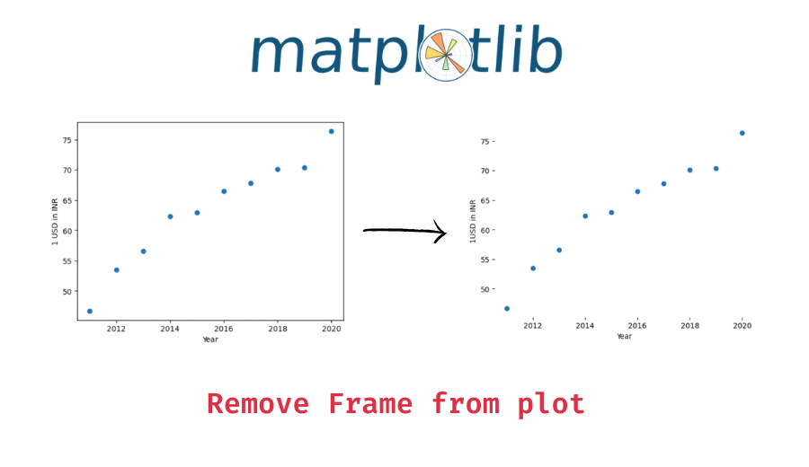
Example 1 – Remove the frame from a plot
Let’s look at an example. First, we will create a simple plot and how it looks with the rectangular frame which is present by default.
import matplotlib.pyplot as plt

# x values - years
x = [2011, 2012, 2013, 2014, 2015, 2016, 2017, 2018, 2019, 2020]
# y values - 1 USD in INR
y = [46.67, 53.44, 56.57, 62.33, 62.97, 66.46, 67.79, 70.09, 70.39, 76.38]

# plot x and y on scatter plot
plt.scatter(x, y)

# add axes labels
plt.xlabel('Year')
plt.ylabel('1USD in INR')
Output:

Now, let’s create the above plot but without the frame using the axes object’s set_frame_on() function. You can use the pyplot object’s gca() function to get the current plot’s axes object and then apply the set_frame_on() function.
# plot x and y on scatter plot
plt.scatter(x, y)

# add axes labels
plt.xlabel('Year')
plt.ylabel('1USD in INR')

# remove the rectangular frame of the plot
plt.gca().set_frame_on(False)
Output:

The rectangular frame is now removed.
Example 2 – Remove the frame from subplots
You can similarly remove the frame from a subplot as well. For this, use the subplot’s axes object’s set_frame_on() function.
Introductory ⭐
- Harvard University Data Science: Learn R Basics for Data Science
- Standford University Data Science: Introduction to Machine Learning
- UC Davis Data Science: Learn SQL Basics for Data Science
- IBM Data Science: Professional Certificate in Data Science
- IBM Data Analysis: Professional Certificate in Data Analytics
- Google Data Analysis: Professional Certificate in Data Analytics
- IBM Data Science: Professional Certificate in Python Data Science
- IBM Data Engineering Fundamentals: Python Basics for Data Science
Intermediate ⭐⭐⭐
- Harvard University Learning Python for Data Science: Introduction to Data Science with Python
- Harvard University Computer Science Courses: Using Python for Research
- IBM Python Data Science: Visualizing Data with Python
- DeepLearning.AI Data Science and Machine Learning: Deep Learning Specialization
Advanced ⭐⭐⭐⭐⭐
- UC San Diego Data Science: Python for Data Science
- UC San Diego Data Science: Probability and Statistics in Data Science using Python
- Google Data Analysis: Professional Certificate in Advanced Data Analytics
- MIT Statistics and Data Science: Machine Learning with Python - from Linear Models to Deep Learning
- MIT Statistics and Data Science: MicroMasters® Program in Statistics and Data Science
🔎 Find Data Science Programs 👨💻 111,889 already enrolled
Disclaimer: Data Science Parichay is reader supported. When you purchase a course through a link on this site, we may earn a small commission at no additional cost to you. Earned commissions help support this website and its team of writers.
Let’s first create a plot with two subplots.
fig, (ax1, ax2) = plt.subplots(1, 2, figsize=(10, 5))

# plot the first subplot
ax1.scatter(x, y)
# add axis labels
ax1.set_xlabel('Year')
ax1.set_ylabel('1USD in INR')

# plot the second subplot
ax2.scatter(x, y)
# add axis labels
ax2.set_xlabel('Year')
ax2.set_ylabel('1USD in INR')
Output:

Here we created two subplots in a single row. The data in the subplots is the same but that is not important what we want to focus on is to how can we remove the frame from a subplot.
Let’s now plot the same subplots again but this time with the frame of the first subplot removed.
fig, (ax1, ax2) = plt.subplots(1, 2, figsize=(10, 5))

# plot the first subplot
ax1.scatter(x, y)
# add axis labels
ax1.set_xlabel('Year')
ax1.set_ylabel('1USD in INR')
# remove the rectangular frame of the subplot
ax1.set_frame_on(False)

# plot the second subplot
ax2.scatter(x, y)
# add axis labels
ax2.set_xlabel('Year')
ax2.set_ylabel('1USD in INR')
Output:

The frame of the first subplot is removed but its ticks and tick labels are intact.
You might also be interested in –
- Add Title to Each Subplot in Matplotlib
- Matplolib – Hide Axis in a Plot (Code with Examples)
- Matplotlib – Change the Number of Ticks in a Plot
- Remove Tick Labels from a Plot in Matplotlib
Subscribe to our newsletter for more informative guides and tutorials.
We do not spam and you can opt out any time.